This is the second part of my UI lessons from the real world article. It has more funny examples of what (not) to do with your UIs.
You guessed it, folks. After the huge success of my first article Ten UI Lessons from the Real World, I decided to write the second part with more examples. Again, the idea is to teach UI lessons based on real world images that are funny and interesting for this type of discussion.
Lesson 11 – Don’t redefine concepts
 Please look at the image on the left. Why on earth would someone call a banana a “curved yellow fruit”?! OK, it is curved, it is yellow and it is a fruit, but WTF?
If you don’t know how to call a certain thing, please ask the business analyst. Don’t try to create a name that is meaningful to you but meaningless to the user. Applications should have standardized concepts and the whole team should understand them. FYI: this field of research is called ontology and it is a great domain analysis tool.
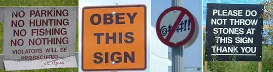
Lesson 12 – UIs should never surprise the user
 The UI should never surprise the user. If it does, then the designer has failed to do a good job. One example of this problem is a link that doesn’t look clickable. This is actually conflicting with the idea that UIs should be clear and intuitive. How can something be surprising and intuitive at the same time?
Joel Spolsky has explained this lesson on his bookUser Interface Design for Programmers. Refer to the book if you want to see more examples on this problem.
Lesson 13 – UIs should never scare the user
Users shouldn’t be scared by the UI. If they are, they won’t use the system correctly and you will fail as a software engineer. If something can go wrong, it is your responsibility to create restrictions that will prevent wrong actions (unless the business itself is risky – e.g., trade market).

Lesson 14 – Don’t ask users to do stupid things
The UI should never indirectly imply that something stupid can be done. You somehow tease the imagination of those people that have low IQ scores and have nothing else to do in life:
Lesson 15 – UIs should be easy to read
 One of the ideas behind simplicity is that UIs should be understandable and easy to read. The clock on the left is an example of how things can get critical if you must read it immediately. Of course you know the position of the numbers, but imagine different situations where you must read them (e.g., the clock is rotated 90 degrees). Since you need some seconds to calculate the numbers, this will distract (and even disturb) you more than needed. By the way, what time does the clock show right now?
Lesson 16 – Users should never ask “What is this?”
 Which animal is this? Is this a cat? A bunny? Some people say it is a small camel! Use your imagination 😛
Users should never ask questions like “What is this?” when it comes to your UI. If they do, the designer has failed to create a good intuitive interface. UAT (User Acceptance Tests) is a great tool to find problems in this sense and you should talk to your team about this. Watch how your friends use the software application and ask them to do certain tasks (e.g., open a new document; create a new invoice, etc). You should also talk to the support team and see what people have been complaining about. You will learn a lot from that, trust me.
Lesson 17 – Don’t distract users with obvious messages
Please look at the next two signs and think. Are they useful in your opinion? What is the chance that you won’t see the stairs, but will see the sign? Or what is the real value of the second sign and its warning?
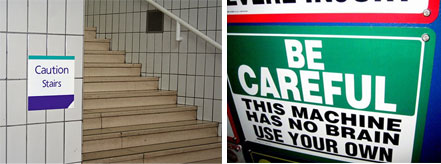
Please don’t add obvious messages to your UIs because they will distract (and probably disturb) your users. UIs should guide the user, not force them to look at every detail on the screen. Their eyes should do this job seamlessly.
Lesson 18 – Accessibility should work in practice
 We all know that accessibility features (in general) are used by just a small group of users. But if you decide to implement them, please make sure they are really useful in practice. If you don’t know what I mean, please look at the image on the left.
Look, there are nice toilets on the second floor! Yes, but you need a crane if you are on a wheelchair.
Lesson 19 – Know your users
 You can’t create good interfaces if you don’t know your users. Things can get more difficult if they are aliens, but it is always possible to figure out what they really want. Talk to your users (maybe using a translator helmet) and try to understand how the see the world (not only our world, but also their world).
Lesson 20 – Creativity Again
The last lesson of my previous article was about creativity and its powerful effects on our brains. I will keep creativity again as the last lesson of this second part because it is really worth doing so. Please look at the AXE marketing signs displayed at shopping centers and malls… they are simple, easy to understand and – most important – have a real marketing message.

Conclusion
This was the second part of my article about user interfaces and their lessons from the real world. What is most fascinating is the fact that we can take lessons from almost anything visual. All we need is to think about our problems and create a bridge to real world signs and objects. Stay tuned for the next articles.

 Another problem related to icons is best explained when we look at the image on the right. At first glance, you might see a dentist with a patient. But if you look closer, you might note a dirty second meaning. Would you let your wife go to that dentist? I don’t think so…
 Look at this second example. By placing both signs together, it is inevitable to imagine people hunting children. When the worker placed the second sign, he probably saw the problem, but he didn’t care. He might have thought that the problem was with him, not with other people.
 Isn’t that yummy? This might be good for your cholesterol levels.
 This sign is in Portuguese, but I don’t think we need a translation here. The problem is right ahead and it is difficult to understand why people keep repeating the same information again and again. What worries me is the fact that they do that too often.

 Sometimes too much precision can be useless. Take a closer look at the next sign and let me know if that extra half mile is important to you. Information like that is inappropriate for the situation and only adds noise and clutter. Drivers usually have just a few seconds to read a sign and the more information you add, the worse it will be. The same applies to software UI.
 A sentence with a wrong meaning is worse than a typo. That’s the case of our next sign: If your worries aren’t strong enough to kill you, the church can give *them* a hand.
 Alignment is important because users don’t read text on the UI. They scan it. So, well aligned text and controls can help dividing the screen into digestible pieces of information. Unfortunately this isn’t the case of our next picture. After reading the first sign, I wonder if people hire cats to make burgers with their flesh.
 At last, remember that your creativity can connect the user with a whole new experience. Let your imagination fly when you build user interfaces, as it happens with the guys from the last picture. Good interfaces make users forget their computers pretty much like readers forget their books when they read good stories.
 Figure 2: Elegant Look-and-Feel with glossy components.